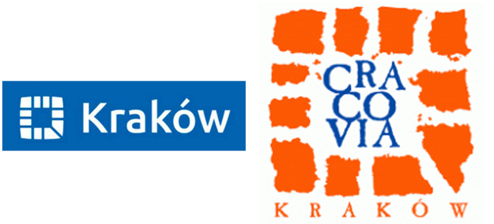
The new Kraków city logo has been revealed ahead of it’s official launch later this month.
The refreshed logo is a blue modern/minimalist take on the familiar orange logo, representing the streets leading from the Rynek.

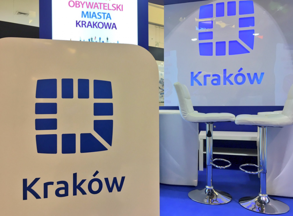
The new logo is on prominent display at a ‘Citizen’s Budget’ (Budżetu Obywatelskiego Krakowa) information point in Mały Rynek.

The new logo has already been likened to a blue bagel and compared to the Polish Police logo. What do you think of the new design?


I totally miss the orange color from the previous logo in this new one. To me, Krakow is a city where brick is present everywhere in its architecture so I can see the bond with orange which is a warm, welcoming and dynamic color but in my opinion, only ‘blue and white’ in this new logo doesn’t really describe Krakow. It’s a new conception that makes me think of Krakow 🚎 buses and 👮🏻 police? But I can’t connect it to anything else. Anyone? Perhaps highway signs? I don’t quite understand the new logo color code…
At first I thought: Microsoft Windows.
Then: a cafe ashtray.
Now I’ve seen it in use on signs, I think it works well in that you can spot it easily if you are trying to look for it in busy places. Being a simple shape helps!